Reading SST and Chlorophyll Charts: Finding the Break That Holds Fish
Pelagic fish don’t spread out evenly across the ocean — they stack up on edges. A temperature break, a color change, a current seam: that’s where bait concentrates, and where tuna, wahoo, and mahi go to eat. Satellite SST (sea surface temperature) and chlorophyll charts are how you find those edges before you ever leave the dock, and — with connectivity on board — how you keep finding them after you’re already running.
What an SST chart is actually showing you
An SST chart is a color-coded map of surface water temperature, and the number itself matters less than the gradient. A wide band of even 78°F water tells you nothing useful. A tight break where the color bands stack up close together — say, 74°F to 78°F in a couple of miles — is a real edge, and that’s where you want your spread. Warm-core eddies spinning off the Gulf Stream are the other feature worth circling: they trap bait inside a rotating current, and the edge of the eddy is often as productive as the Stream itself.
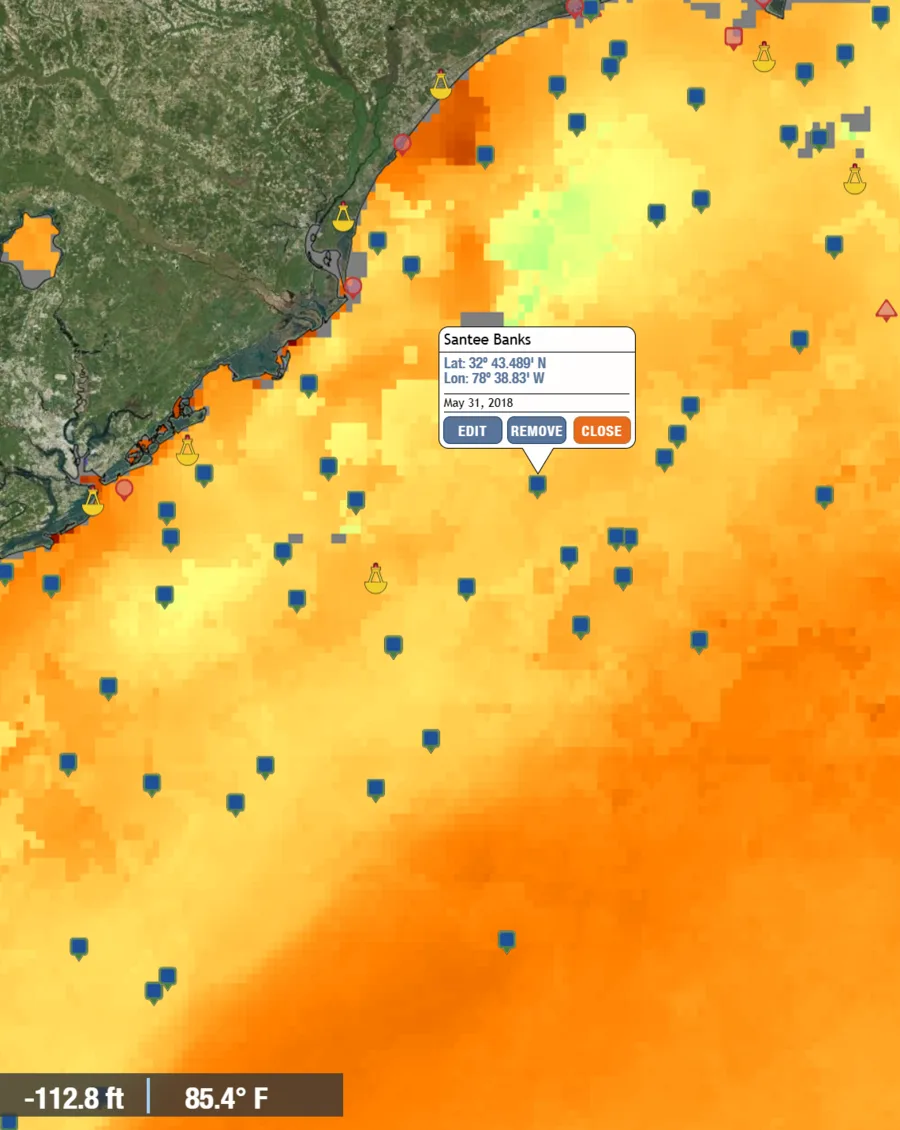
The green patch in the chart above sitting inside the orange is exactly the kind of anomaly worth marking — a distinct break from the water around it, right where one of my saved spots sits. That’s the whole exercise: find the thing that doesn’t match its surroundings, and go look at it.
Reading a current chart
Temperature and color aren’t the only layers worth checking — current speed and direction matter just as much, especially anywhere close to the Gulf Stream. Current charts show direction with arrows and speed with color, usually blue-to-purple for slow water and green-to-red for the fast-moving core of the Stream.
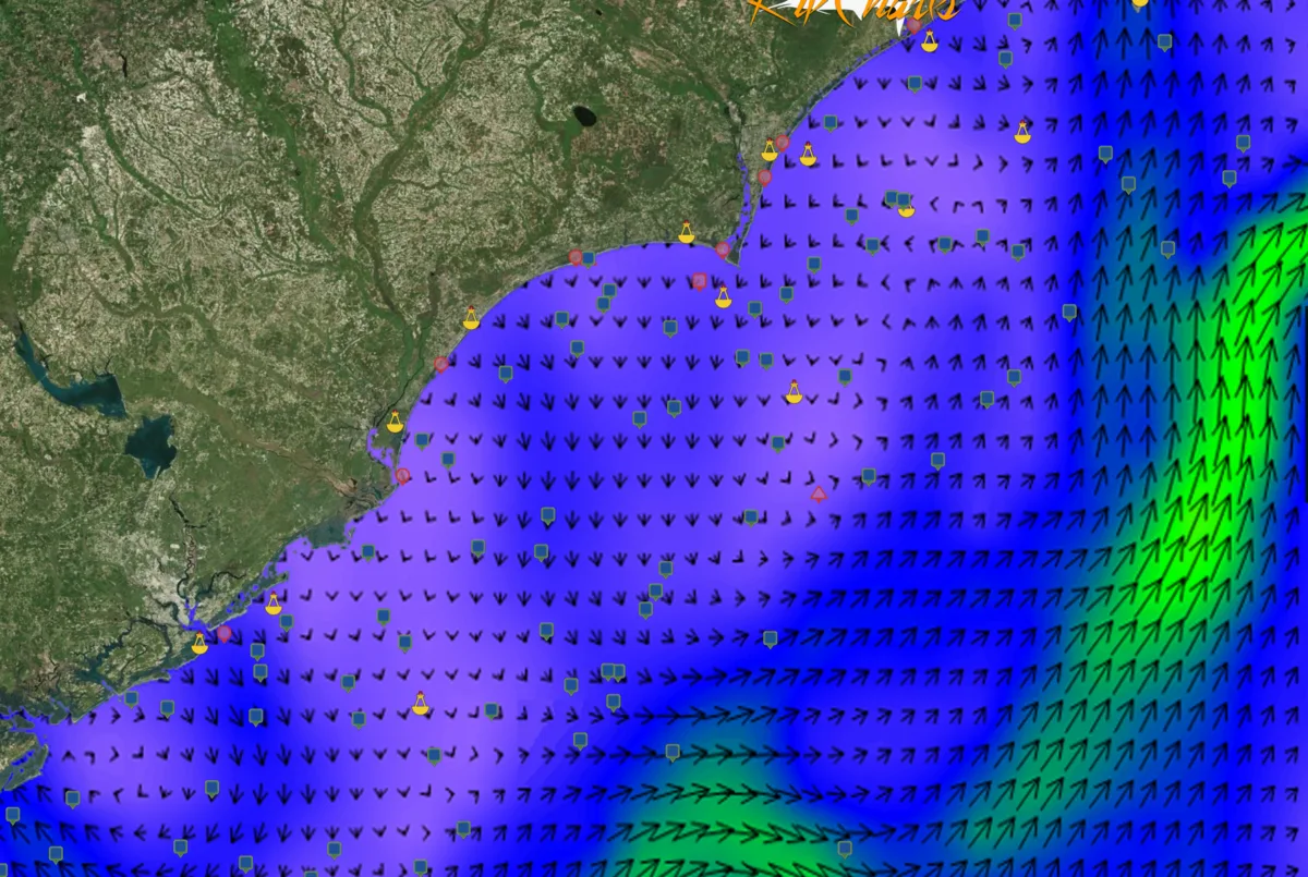
That green band pushing in from the east in the chart above is the Gulf Stream’s edge — the line where the current suddenly picks up speed and the arrows swing hard to follow it. Bait and structure-oriented fish stack up right on that seam, same as they do on a temperature or color break, and it’s often the sharpest, most consistent edge of the three because the Stream doesn’t wander far day to day the way a warm patch can.
What a chlorophyll chart adds
Chlorophyll charts measure ocean color, which is really a proxy for productivity — greener water means more plankton and often more bait, bluer water is clearer, nutrient-poor, oceanic water. The edge between green and blue is the piece that matters, and it’s often the one you can actually see with your own eyes running the boat: a visible color change in the water, sometimes with a distinct color line and floating weed or debris riding it. When a chlorophyll edge lines up with a temperature break in the same spot, that’s the highest-confidence water on the chart — run there first.
Stacking the layers
The way to actually use this: start with the temperature break, check whether a chlorophyll edge or a current seam lines up with it, and then look at what’s underneath — a ledge, a canyon wall, structure on the bottom. An edge over structure beats an edge over a flat bottom every time, and two or three edges stacked on top of each other beats just one. That’s the same logic behind planer fishing and the trolling spread — you’re always trying to put the boat where multiple things line up at once, not just one.
Where to actually get the charts
A few routes, and they’re not mutually exclusive:
- Subscription chart services built specifically for this — RipCharts, Hilton’s Realtime Navigator, ROFFS, and FishTrack are the names that come up most in the offshore community, layering SST, chlorophyll, and current speed/direction into one annotated chart (the current chart above is a RipCharts pull).
- Free government sources — NOAA CoastWatch publishes raw SST and chlorophyll satellite passes at no cost; it takes more interpretation than a subscription service that annotates the breaks for you, but the underlying data is the same.
- Chartplotter overlays — if you’re running Garmin or Simrad electronics with a SiriusXM Marine weather subscription, SST overlay comes right into the plotter without a separate app. It’s less detailed than a dedicated chart service, but it’s already on the screen you’re driving from.
The difference Starlink actually makes
Here’s the part that changes everything: satellite SST and chlorophyll passes aren’t live video — they’re built from actual satellite overflights, and cloud cover can blank out a chunk of the chart for days at a time. The chart you download at the dock the night before might already be your best available look at the water, or it might get replaced by a clean new pass by mid-morning. Without connectivity, you’re committed to whatever you had at the ramp. With Starlink Mini running on the boat, you pull a fresh chart on the way out, and if a cleaner pass posted overnight or a break moved 10 miles from where you planned, you find out before you arrive instead of after a wasted run. Cross-reference it against Windy’s swell and wind layers for the ride out, and you’ve got the full picture — not the picture from last night.
Bottom line
Find the break, check whether the color lines up with it, run it over structure if you can, and — if you’ve got the connectivity to do it — check it again on the way out instead of trusting a chart that’s already gone stale. The edge is always out there; the boats that find it fastest are usually just the ones looking at the freshest data.
This article may contain affiliate links. If you buy through them, we may earn a small commission at no extra cost to you. Learn more.